21Modal
Modals are containers that display in a layer above the app. They inform users about a specific task and may contain critical information, require decisions, or involve multiple tasks.
Before you apply, we need to know a little more about you!
Tip: Click “Edit my profile” to complete your profile in a new tab. Once you’ve published your profile, return to this tab and refresh the page to apply.
Hey there! It looks like you are in the middle of editing and have unsaved changes. Save before you go!
<div class="row">
<div class="column small-6">
<div class="bbm-modal bbm-modal--open">
<div class="bbm-modal__topbar">
<h3 tabindex="0" class="bbm-modal__title">
Looks like your profile is incomplete...
</h3>
<button class="bbm-modal__close js-cancel" aria-label="close modal" type="button">
<svg class="svg-icon svg-icon--black" role="img" ><use xlink:href="/static/svg/sprite/symbol/sprite.svg#icon--close"></use></svg>
</button>
</div>
<div class="bbm-modal__section">
<p class="text-left mb0">
Before you apply, we need to know a little more about you!
</p>
<p class="text-left mb0 border-top">
<strong>Tip</strong>:
Click “Edit my profile” to complete your profile in a new tab.
Once you’ve published your profile, return to this tab and refresh
the page to apply.
</p>
</div>
<div class="bbm-modal__bottombar clearfix">
<div class="sy-button-group text-right">
<button class="button button--secondary" type="button">Cancel</button>
<button class="button" type="button">Edit</button>
</div>
</div>
</div>
</div>
<div class="column small-6">
<div class="bbm-modal bbm-modal--open">
<div class="bbm-modal__topbar">
<h3 tabindex="0" class="bbm-modal__title">Are you sure you want to leave?</h3>
<button class="bbm-modal__close js-cancel" aria-label="close modal" type="button">
<svg class="svg-icon svg-icon--black" role="img" ><use xlink:href="/static/svg/sprite/symbol/sprite.svg#icon--close"></use></svg>
</button>
</div>
<div class="bbm-modal__section">
<p>Hey there! It looks like you are in the middle of editing and have unsaved changes. Save before you go!</p>
<div class="sy-button-group text-center">
<button class="button js-cancel" type="button">Stay on page</button>
<button class="button button--secondary ml1 js-submit" type="button">
<span>Leave</span>
<span class="show-for-medium"> without saving</span>
</button>
</div>
</div>
</div>
</div>
</div>
<br><br>
Structure
1) HEADER
Include a title within the Modal that mirrors the action or button that was clicked by the user. Headers include a close button “x” in the upper right-hand corner of the Modal.
2) BODY
The body content within a Modal should be as minimal as possible. Limit elements to brief paragraph text, secondary links, and/or form inputs (such as radio, checkboxboxes, text area, selects).
3) FOOTER
The footer area of a Modal typically contains a group of buttons. Depending on the target of the application buttons are presented in a different way:
- For Corps Members center-align.
- For Organizations/Networks right-aligned.
The Primary buttons/actions should be placed on the right side of the group. Refer to Button guidelines for usage. If the Modal is displayed on mobile devices, the buttons are presented across the width of the container, one below the other, and the main action is at the very bottom of the footer
Usage
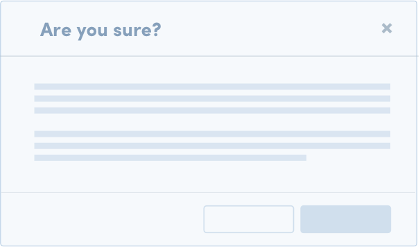
TRANSACTIONAL
Use a clear question and options in dialog.
Avoid more than 2 actions in the footer
Notify the user after the action.
PASSIVE NOTIFICATIONS
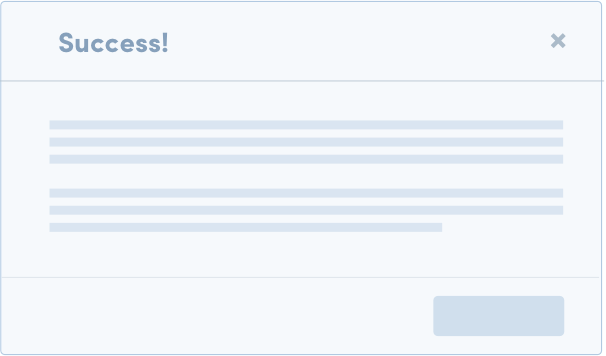
Avoid using this Modal when possible (See Notifications)
Include a helpful link or action
INPUT
Limit number of inputs so users don’t have to scroll
Avoid multiple steps or wizards in input Modals
Input modals should not launch other dialogs on top of the Modal
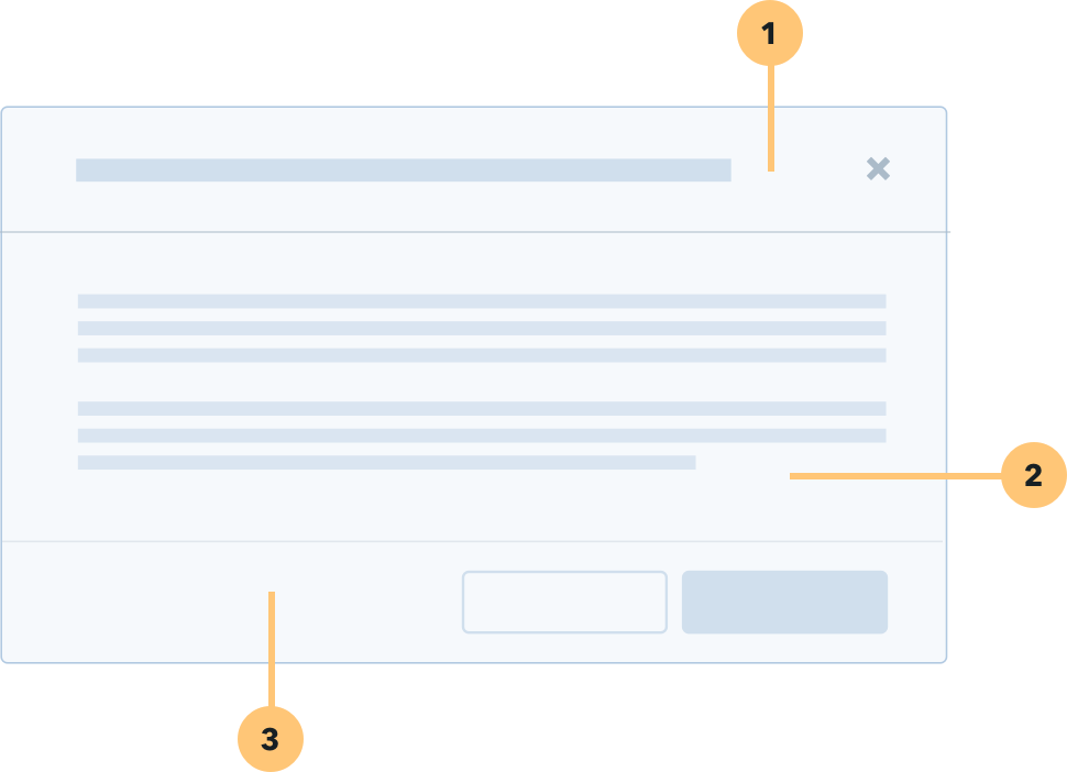
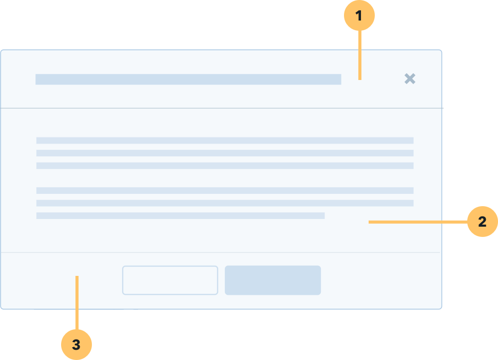
<h3 class="mb2">Structure</h3>
<div class="row">
<div class="column small-6">
<img src="/styleguide/images/modal--structure.png">
</div>
<div class="column small-6">
<img src="/styleguide/images/cm-modal--structure.png">
</div>
</div>
<div class="row">
<div class="columns small-7 mb2">
<h4 class="color-deep-medium-navy heading--micro">1) HEADER</h4>
<p>
Include a title within the Modal that mirrors the action or button that was clicked by the user. Headers include a close button “x” in the upper right-hand corner of the Modal.
</p>
<h4 class="color-deep-medium-navy heading--micro">2) BODY</h4>
<p>
The body content within a Modal should be as minimal as possible. Limit elements to brief paragraph text, secondary links, and/or form inputs (such as radio, checkboxboxes, text area, selects).
</p>
<h4 class="color-deep-medium-navy heading--micro">3) FOOTER</h4>
<p>
The footer area of a Modal typically contains a group of <a href="/styleguide/section-buttons.html" class="link--secondary">buttons</a>. Depending on the target of the application buttons are presented in a different way:
</p>
<ol>
<li>For Corps Members center-align.</li>
<li>For Organizations/Networks right-aligned.</li>
</ol>
<p>
The Primary buttons/actions should be placed on the right side of the group. Refer to Button guidelines for usage.
If the Modal is displayed on mobile devices, the buttons are presented across the width of the container,
one below the other, and the main action is at the very bottom of the footer
</p>
</div>
</div>
<h3 class="border-top mb2 pt2 mb1">Usage</h3>
<h4 class="color-deep-medium-navy heading--micro">TRANSACTIONAL</h4>
<div class="small-8 mb2 lh2">Transactional modals are used to validate user decisions or to gain secondary confirmation from the user. Typically, the Modal requests either a ‘confirm’ or ‘cancel’ response. It’s important that a Modal doesn’t obscure information that might be useful for users. For example, a dialog asking users to confirm the deletion of some items should list the items being deleted.</div>
<div class="row mb2">
<div class="column small-5">
<img src="/styleguide/images/modal--usage--transactional.png">
</div>
<div class="column small-7 pl2">
<p>
<svg class="svg-icon svg-icon--black mrh" role="img" ><use xlink:href="/static/svg/sprite/symbol/sprite.svg#icon--check"></use></svg>
Use a clear question and options in dialog.
</p>
<p>
<svg class="svg-icon svg-icon--black mrh" role="img" ><use xlink:href="/static/svg/sprite/symbol/sprite.svg#icon--close"></use></svg>
Avoid more than 2 actions in the footer
</p>
<p>
<svg class="svg-icon svg-icon--black mrh" role="img" ><use xlink:href="/static/svg/sprite/symbol/sprite.svg#icon--check"></use></svg>
Notify the user after the action.
</p>
</div>
</div>
<h4 class="color-deep-medium-navy heading--micro pt2 mb1">PASSIVE NOTIFICATIONS</h4>
<div class="small-8 mb2 lh2">Passive modals notify the user but no do not require a specific action. We highly discourage the use of these modal because they are distruptive. Consider using a dismissable <a href="/styleguide/section-notification.html" class="link--secondary">Notification</a> instead. A passive modal may be appropriate when there is a something that must be addressed immediately. For example, upon clicking “delete” a dialog telling the user they must decline candidates before they can delete a listing.</div>
<div class="row mb2">
<div class="column small-5">
<img src="/styleguide/images/modal--usage--passive.png">
</div>
<div class="column small-7 pl2">
<p>
<svg class="svg-icon svg-icon--black mrh" role="img" ><use xlink:href="/static/svg/sprite/symbol/sprite.svg#icon--close"></use></svg>
Avoid using this Modal when possible (See <a href="/styleguide/section-notification.html" class="link--secondary">Notifications</a>)
</p>
<p>
<svg class="svg-icon svg-icon--black mrh" role="img" ><use xlink:href="/static/svg/sprite/symbol/sprite.svg#icon--check"></use></svg>
Include a helpful link or action
</p>
</div>
</div>
<h4 class="color-deep-medium-navy heading--micro pt2 mb1">INPUT</h4>
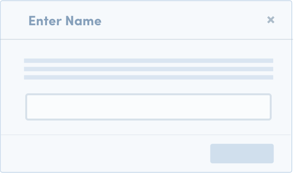
<div class="small-8 mb2 lh2">Input modals are used to focus a user’s attention on form input(s) requried to accompolish a task. This type of Modal is most effective when its number of fields are limited and when it represents one step of a workflow.</div>
<div class="row mb2">
<div class="column small-5">
<img src="/styleguide/images/modal--usage--input.png">
</div>
<div class="column small-7 pl2">
<p>
<svg class="svg-icon svg-icon--black mrh" role="img" ><use xlink:href="/static/svg/sprite/symbol/sprite.svg#icon--check"></use></svg>
Limit number of inputs so users don’t have to scroll
</p>
<p>
<svg class="svg-icon svg-icon--black mrh" role="img" ><use xlink:href="/static/svg/sprite/symbol/sprite.svg#icon--close"></use></svg>
Avoid multiple steps or wizards in input Modals
</p>
<p>
<svg class="svg-icon svg-icon--black mrh" role="img" ><use xlink:href="/static/svg/sprite/symbol/sprite.svg#icon--check"></use></svg>
Input modals should not launch other dialogs on top of the Modal
</p>
</div>
</div>
21.2Accessibility
If a modal is opened, the focus is trapped within the modal. When the dialog closes, focus should return to the element that invoked the dialog unless the invoking element no longer exists because the user is directed to the new page. Then, focus is set on another element that provides logical workflow.
21.3Modal with inputs
Weight: -1
Modal with inputs
<h3 class="mb2">Modal with inputs</h3>

<div class="kss-button-box">
  <button id="showModalButton" class="button button--medium-expand">
      Click to show modal
  </button>
</div>

<div id="js-cancel-application-modal"></div>

<script type="text/x-underscore-template" id="js-cancel-application-modal-template">
  <div class="bbm-modal__topbar">
      <h3 tabindex="0" class="bbm-modal__title">
          Modal with inputs
      </h3>
      <button class="bbm-modal__close js-cancel" type="button">
          <svg class="svg-icon " role="img"><use xlink:href="/static/svg/sprite/symbol/sprite.svg#icon--close"></use></svg>
      </button>
  </div>
  <div class="bbm-modal__section">
      <p>
          Some text example
      </p>
      <input class="validation__field form-control input active" type="text" />
  </div>
  <div class="bbm-modal__bottombar clearfix">
    <div class="sy-button-group right">
        <button class="button button--secondary js-cancel" type="button">Cancel</button>
        <button class="button" type="submit">Submit</button>
    </div>
  </div>
</script>

<script src="/static/js/manifest.js"></script>
<script src="/static/js/vendor.js"></script>
<script src="/static/js/main.js"></script>
<script>
  var button = document.getElementById("showModalButton");
  button.addEventListener('click', (e) => {
    e.preventDefault();

    var Modal = Backbone.Modal.extend({
      template: '#js-cancel-application-modal-template',
      cancelEl: '.js-cancel',
      submitEl: '.js-submit',
    });
    var modalView = new Modal();

    document.querySelector('#js-cancel-application-modal').appendChild(modalView.render().el);
  });
</script>
21.4Hero modal
Hero modals are used to focus a user’s attention. This type of Modal is most effective when the outcome of action affects other user - e.g. generated link for potential Corps Members.
Send corps members a direct link to enroll in this position
<div class="bbm-modal bbm-modal--open" style="opacity: 1;" modal-opened="modal-opened" role="dialog" aria-modal="true">
    <div class="modal-div bbm-modal__views">
        <div class="hero-modal__header">
                <button class="bbm-modal__close js-cancel" aria-label="close modal" type="button">
                    <svg class="svg-icon svg-icon--white" role="img" ><use xlink:href="/static/svg/sprite/symbol/sprite.svg#icon--close"></use></svg>
                </button>

            <div class="hero-modal__avatar hero-modal__avatar--top hero-modal__icon media-border">
                <img class="hero-modal__media lazyload" src="/static/images/defaults/avatar-cm-red.jpg" alt="">
            </div>
            <div class="hero-modal__avatar hero-modal__avatar--bottom media-border hero-modal__icon">
                <div class="hero-modal__image lazyload"
                     data-bg="/static/organizations/images/organization-default-logo.png"
                     title="Organization's logo"></div>
            </div>
        </div>
        <div class="row" style="width: auto">
            <div class="columns small-12 small-centered">
                <div class="bbm-modal__section">
                    <div class="row">
                        <div class="columns">
                            <h1 tabindex="0" class="js-header text-center m0 h3">Send corps members a direct link to
                                enroll in this position</h1>
                            <div class="row">
                                <div class="columns small-10 small-centered text-center">
                                    <div class="validation mt2 mb2h" id="js-clipboard">
                                        <div class="field-info field-info--inline">
                                            <input id="js-enrollment-link" aria-label="Link to invite Corps Members"
                                                   class="validation__field"
                                                   style="padding-right: 46px" type="text" name="enrollment-link"
                                                   value="" readonly value="link">
                                            <div class="field-info__details"
                                                 style="background-color: inherit; box-shadow: none;">
                                                <div class="icon-tooltip--right-bottom invisible" tabindex="-1"
                                                     id="js-clipboard-success">
                                                    Copied to clipboard
                                                </div>
                                                <div class="icon-tooltip--right-bottom invisible" tabindex="-1"
                                                     id="js-clipboard-error">
                                                    Failed to copy
                                                </div>
                                            </div>
                                        </div>
                                    </div>
                                    <div class="text-center mb1">
                                        <button class="button button--primary js-clipboard" data-clipboard-text="">
                                            Copy to Clipboard
                                        </button>
                                    </div>
                                    <div class="text-center">
                                        <a class="link--underline" href="#">View corps members that enrolled via a
                                            link</a>
                                    </div>
                                </div>
                            </div>
                        </div>
                    </div>
                </div>
            </div>
        </div>
    </div>
</div>